Top 30 Font Combinations
Typography explained
When thinking about art, fonts are probably not the first thought that pops up in your mind. In fact, when you’re reading a text whether it’s an ad on the train, an instagram caption or a billboard, fonts aren’t usually what you’re paying attention to. Whether you notice it or not, fonts impact the way we read a message, feel about a message and interpret a message. The reason why? Fonts themselves are part of the design. When you add art into the mix, it brings meaning. This complicates things because if your font and message don’t match, it confuses the reader. Add to the mix, two different fonts and it can become a huge headache.
When it gets to the nitty-gritty of fonts, there’s a lot of different aspects that make a font, a font. After all, there’s much more involved than just style and spacing. Let’s go over the basics.
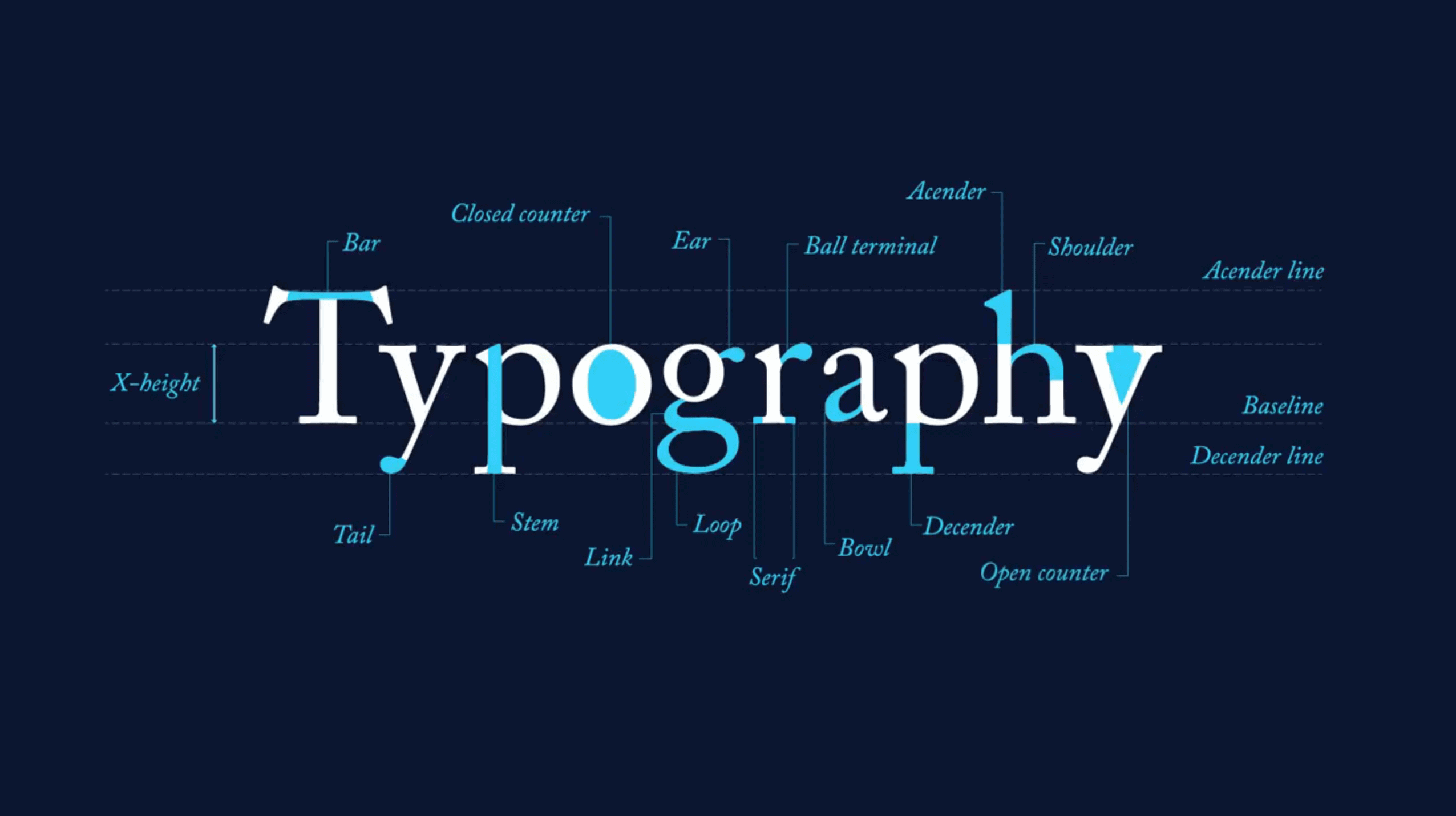
Terminal
This is a type of curve that’s most would define at the end of a stroke, whether this is straight or curved, that doesn’t have a serif. Keep in mind this can include a serif font, just on curves that don’t have a serif such as the bottom of an “n”.
X-height
This encompasses the height of a letter from the baseline to the mean line of a lowercase letter. Think: the height of the letter “x”, “w”, or “z”. Cap-height This is the height of a capital letter that’s above the baseline, but only capital letters that are flat like “N” or “L”, not letters that are round or pointed (“A” or “O”).
Counter
This is the fully or partially enclosed circular or curved white space of certain letters. Think of letters like “a”, “o”, “B” and “P”.
Baseline
This is the line that the text sits on. Bowl Just like the name, this is the rounded part of a letter that is fully closed (“d” and “b”). Ear Similar to where your ear would be on your body, this is a stroke that comes out of the top right side of the bowl of a lowercase “g” or in the angled or curved lowercase “r”.
Descender
This is the portion of the letter that goes below the baseline. Descender Line This is an invisible line that marks the lowest point of a descender in a font. Ascender This is part of the letter that extends above the mean line of a font.
Ascender Line
The opposite of a descender line, this is the invisible line that marks the height of ascenders in a font.
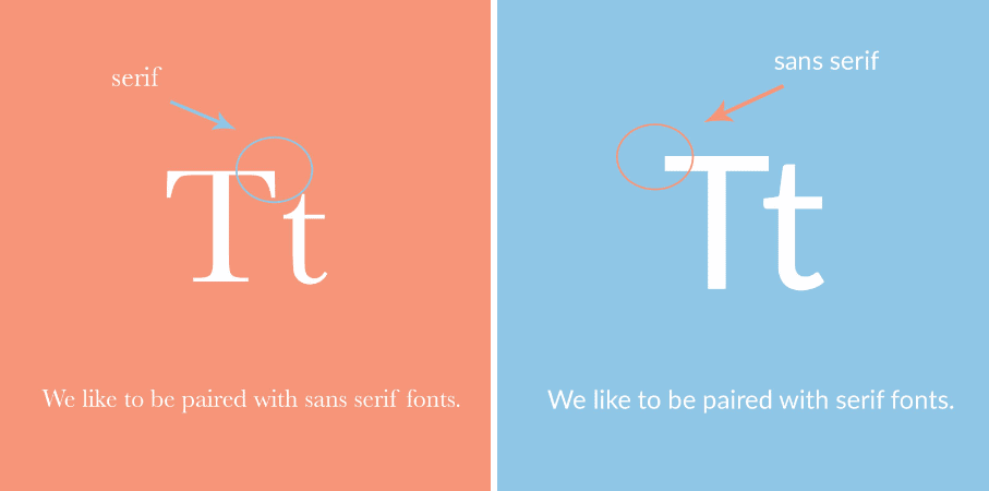
Serifs
These are the little strokes that are at the end of the main vertical and horizontal strokes of certain letters in a font.
Stem
This is the main stroke in a letter, usually vertical.
Just like humans, fonts come in many different shapes and sizes. Just as you would wear a dress to a wedding or a costume to Halloween, you would use certain fonts in certain situations. These different kinds of typography are useful, as they can enhance or change the message you’re looking to convey in your design. There are a few words that will be useful to you as you continue to learn font pairing. These include: serif, sans serif, script, slab serif, alignment and hierarchy.
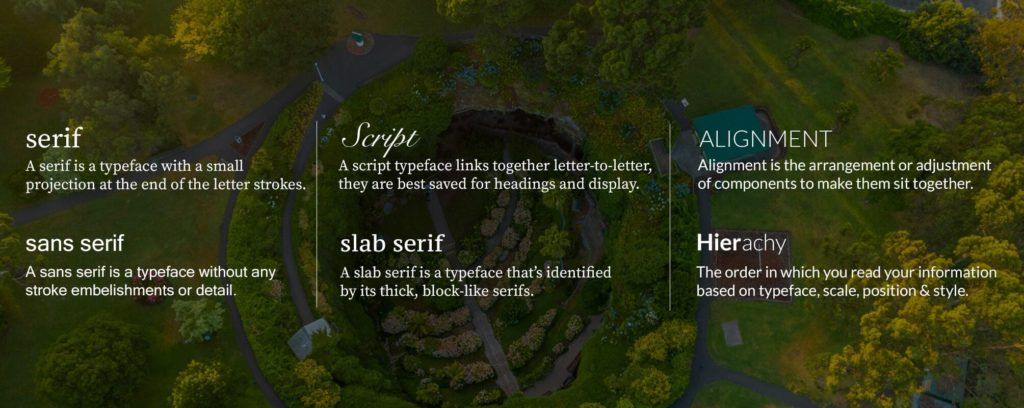
Serif and sans serifs explained
Serif and sans serif fonts are like the yin and yang of fonts. These divide fonts into two different categories, each with their own unique characteristics that impact the feeling and style of the font. If a font is a serif font, it means that there are little feet at the ends of each character, while sans serif fonts are without these feet. Serif fonts were created first and tend to have a more traditional style to them, while sans serif fonts may be considered more modern.
While very different from each other, serif and sans serif fonts pair extremely well with each other. Their different attributes complement each other, rather than compete with each other. When pairing together, allow one font to take the spotlight and the other to take a back seat. Two fonts that are bold or have a loud look to them, do not pair well together. Pairing fonts is like a balancing act that gets more complicated with the more fonts you add to a design.
Bold's list of 30 font combinations
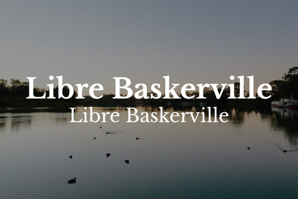
1. League Spartan with Libre Baskerville
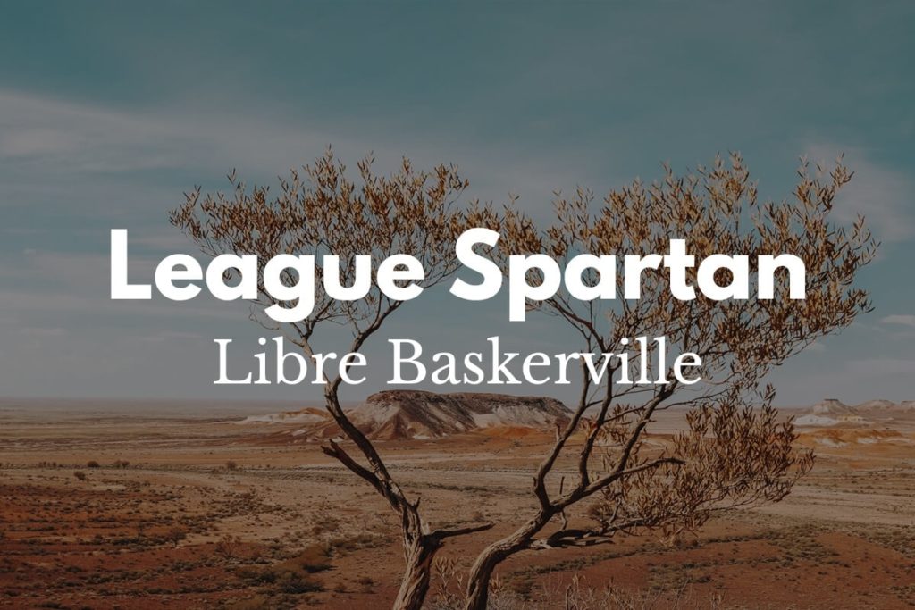
Libre Baskerville is a traditional font that has an elegant characteristic to it. Light and airy, this font pairs well with the bold and geometric modern font of Libre Baskerville. This is a great example of a serif and sans serif font that balances each other out, with League Spartan as the title font.
2. Julius Sans One and Archivo Narrow
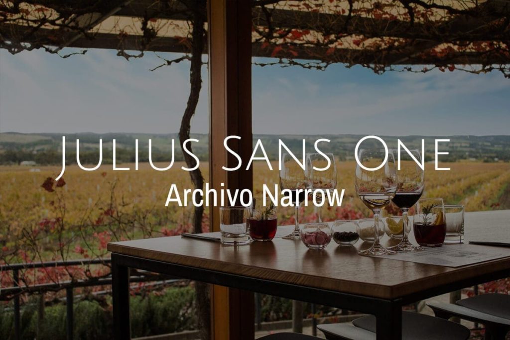
These fonts are similar in style, both having thin strokes and a lightweight to them. While separately these two fonts have a lot in common, comparatively, Archivo Narrow is a much more geometric while Julius Sans has a smoother and delicate look to it. Both fonts are extremely versatile and easy to read.
3. Archivo Black and Archivo Narrow
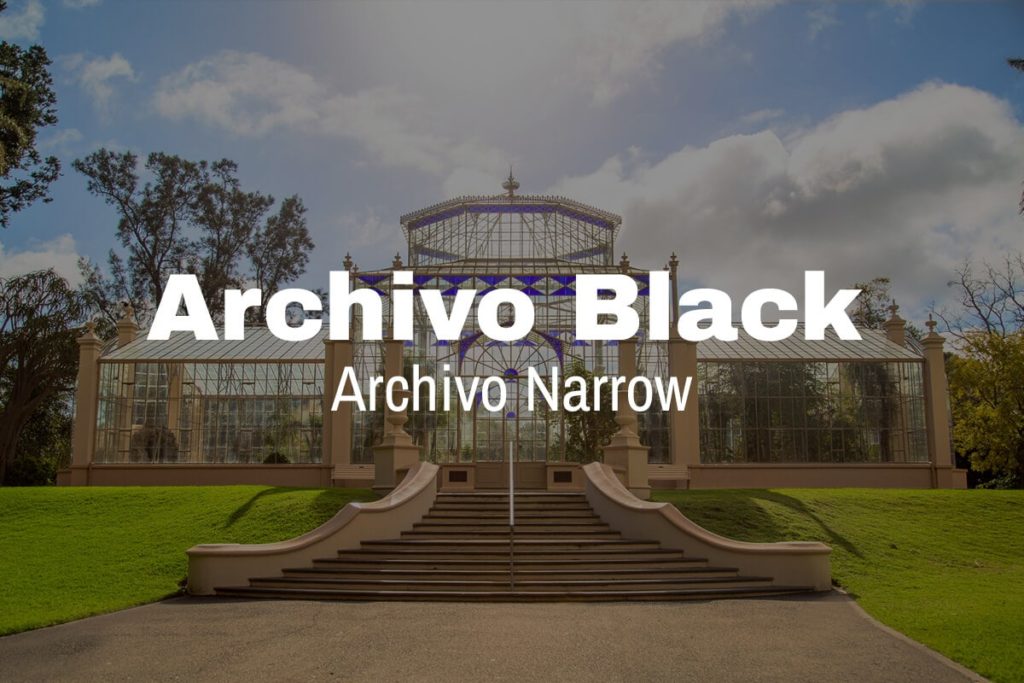
Think of bold. Archivo Black holds a rounded, bold and wide characteristics that make it great for titles and headlines. Paired with a condensed and light Archivo Narrow, create a light-hearted serif combination. Archivo Narrow nicely takes the back seat, serving nicely as body copy and is great when you’re in a cinch for space.
4. Libre Baskerville and Libre Baskerville
Wait, the same font paired together? That’s right! Within each font there is weight, size and space can change the way a font looks, even next to the same font. Sometimes a design just requires a simple look and even a simple italicization can provide a differentiator between a heading and body.
5. Bebas Neue and Montserrat
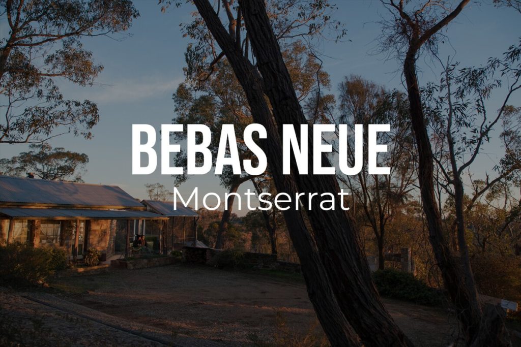
Sophisticated doesn’t have to mean crazy. These two sans serif fonts are both clean and contemporary fonts, with Bebas Neue as a condescended both bold font. Montserrat on the other hand also yields clean lines but is much more wide. These differences in spacing balance the combination, providing a clean and tidy look that’s also modern.
6. Lora with Lora

It may be surprising, but this is another same font pairing that can look extremely different depending on the way you use it. Lora can be portrayed as a flowy and graceful font, while also traditional. If italicized it has a femine touch and bolded it can read as sophisticated. Don’t stray away from using the same fonts together by playing with their different characteristics in other forms.
7. Open Sans Extra Bold with Cooper Hewitt
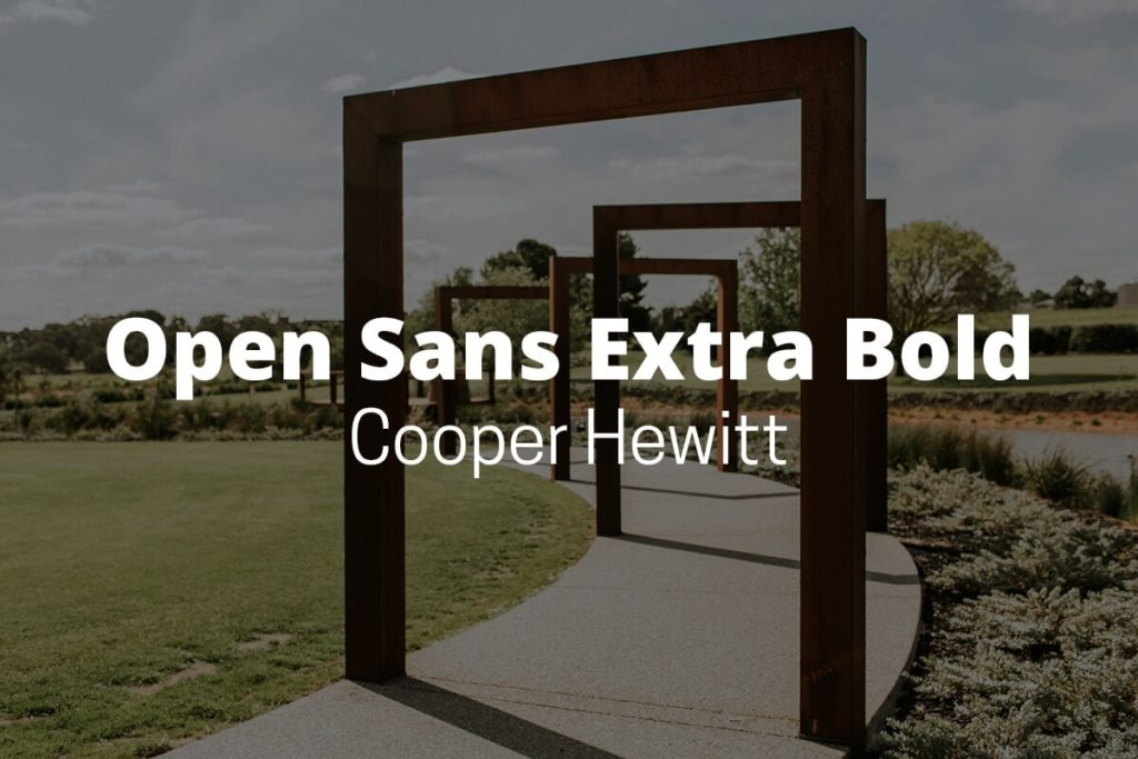
Talk about an attention-getting, Open Sans Extra Bold is exactly as its name implies. The thick lines of this font work well with the light lines of Cooper Hewitt. In all caps, Cooper Hewitt provides a much modern look and can provide separation from headlines to body paragraphs.
8. Roboto Condensed Bold with Roboto Condensed
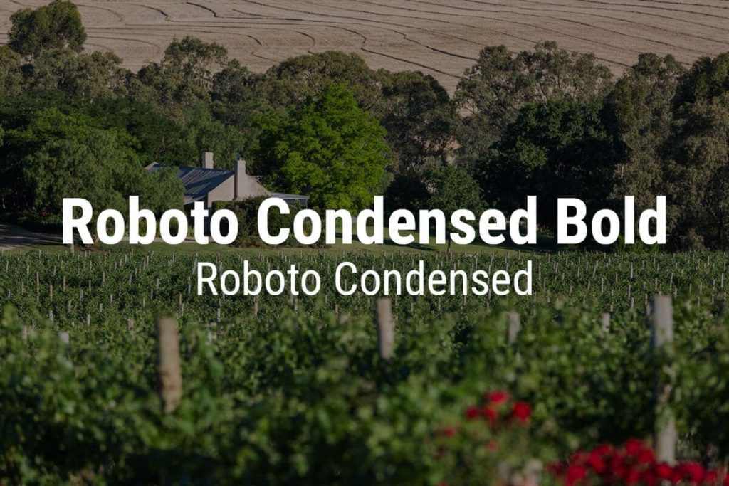
Simple and versatile, Roboto Condensed is an easy to read font. Its simple nature makes it straightforward and able to pair well with most fonts. It can be used as a title or in a paragraph, and both provide a sophisticated style to the design. Play with bond and unbolded to differentiate between sections of your project and provide further entertainment for the eye.
9. Cooper Hewitt Heavy with Cooper Hewitt
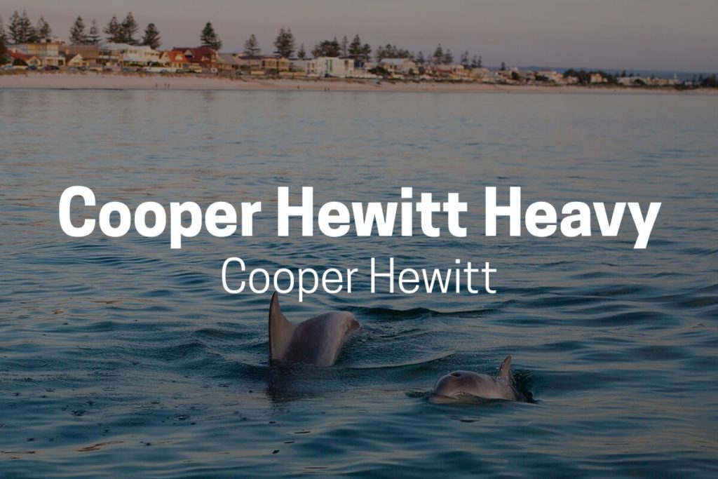
A classic typeface, Cooper Hewitt is known for its curves and arches, which makes it a classic font. Simple yet a flare of personality, this font can be used in many different design projects and works well with many different font types. Versatile in nature, it pairs with itself nicely.
10. Playfair Display Black with Playfair Display
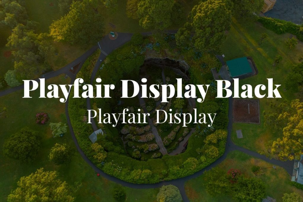
If you’re looking for a font with a flavor of personality, Playfair Display Balck is a playful serif font that doesn’t shy away from making a statement. Playfair Display compliments it well by bringing a timeless sense that provides a unique look compared to other classic fonts.
11. Norwester with Kollektif
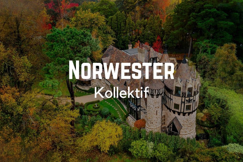
If you’re looking for a structured combination, you’ve landed on one. Norwester provides a geometric and bold font that works extremely well at grabbing the attention of the reader. Kollektif provides a supporting structure with rounded and spread out features. Together, these fonts create an image of strength and stability.
12. Source Serif Pro with Source Sans Pro
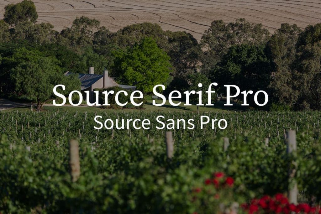
As the serif and sans serif versions of each other, these fonts organically work harmoniously together. This makes it like the yin and yang of fonts. Source Serif Pro works effectively as a headline as well as supporting text. Source Sans Pro provides a clean break from the detail in Source Serif Pro.
13. Yellowtail with Open Sans
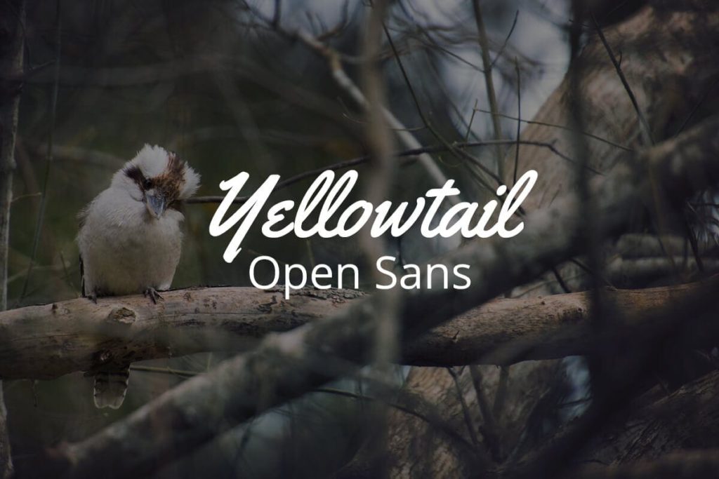
Yellowtail is a fun script font that looks like handwritten lettering. This is a great option if you’re looking for an embellished title or quote on your design. Due to its statement, it’s best used in moderation, which is why it works so well for headlines! It pairs well with basic and simple fonts, like Open Sans.
14. Raleway with Roboto Condensed
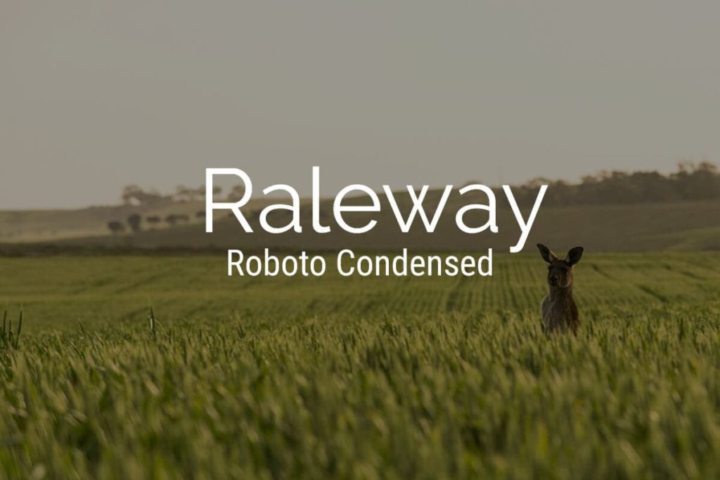
Simple lines work well for spotlight text and supporting text, making these two fonts versatile and a great combination. Raleway is an elegant sans serif that looks modern and sophisticated. Roboto Condensed offsets the wide letters of Raleway, creating a perfect balance.
15. Cinzel with Quattrocento
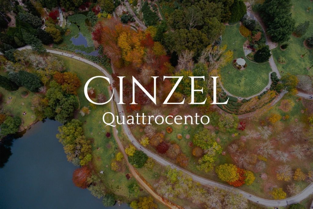
When in Rome, use Cinzel. Inspired by the classical Roman style, this serif font uses characteristics of old inscriptions but with a contemporary flair to it. Quattrocento brings a delicate supporting classic font with wide and open letterforms. Together the combination brings a modern twist to traditional fonts.
16. Oswald with Montserrat Light
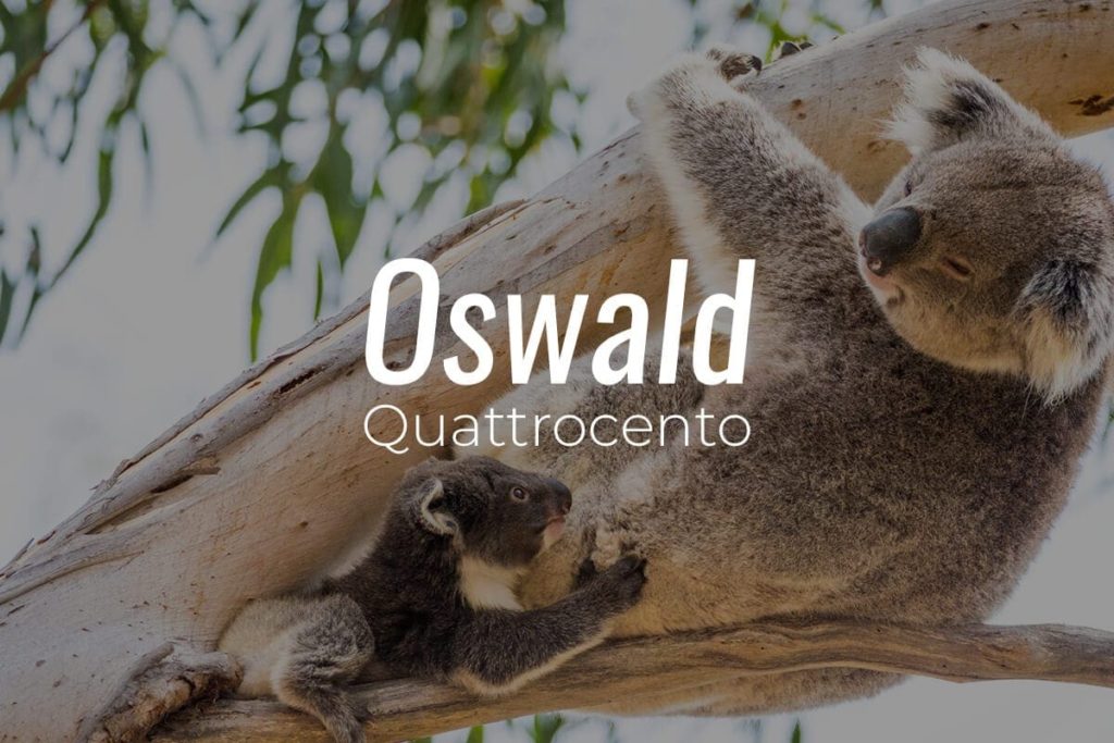
Inspired by an alternate gothic typeface style, Oswald works especially well as a headline in all caps. It’s closely knit letters and bold weight, makes it a great centerpiece of a design, while staying easily readable. Montserrat Light brings a geometric cleanness that brings an editorial or corporate feeling to the combination.
17. Cooper Hewitt thin, with Cooper Hewitt Thin
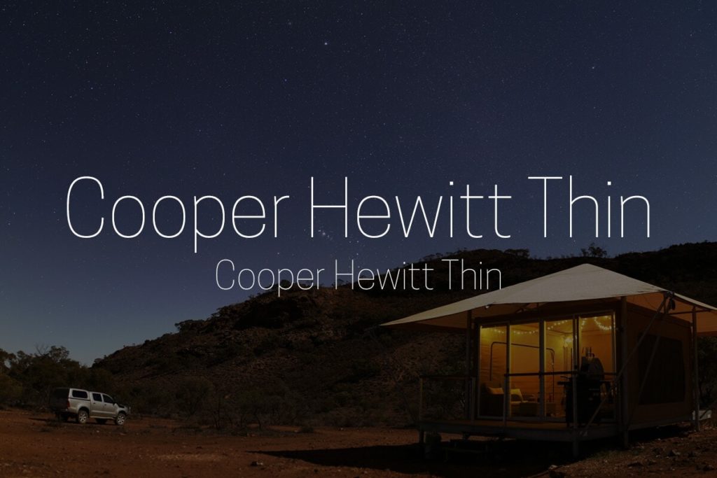
Light may be an understatement with this font. Delicate is a great way to describe Cooper Hewitt Thin, as it’s thin and straight lines have modified geometric curves that give it additional structure without becoming overpowering. This structure allows it to work as a firm headline, but also as a great supporting text. This font is easy to read and looks great on the web!
18. Kollektif with Gidole

Bold, round and strong maybe a few words that come to mind when you look at Kollektif. This font has certain letters that are shorter such as “k” or “t”, that curve the letters next to it. Different from most other modern fonts with straight and geometric lines, not all words may look good in this font. Paired with its opposite, Gidole, that represents a compressed and smoothed lines.
19. Bodoni with Bodoni Italic
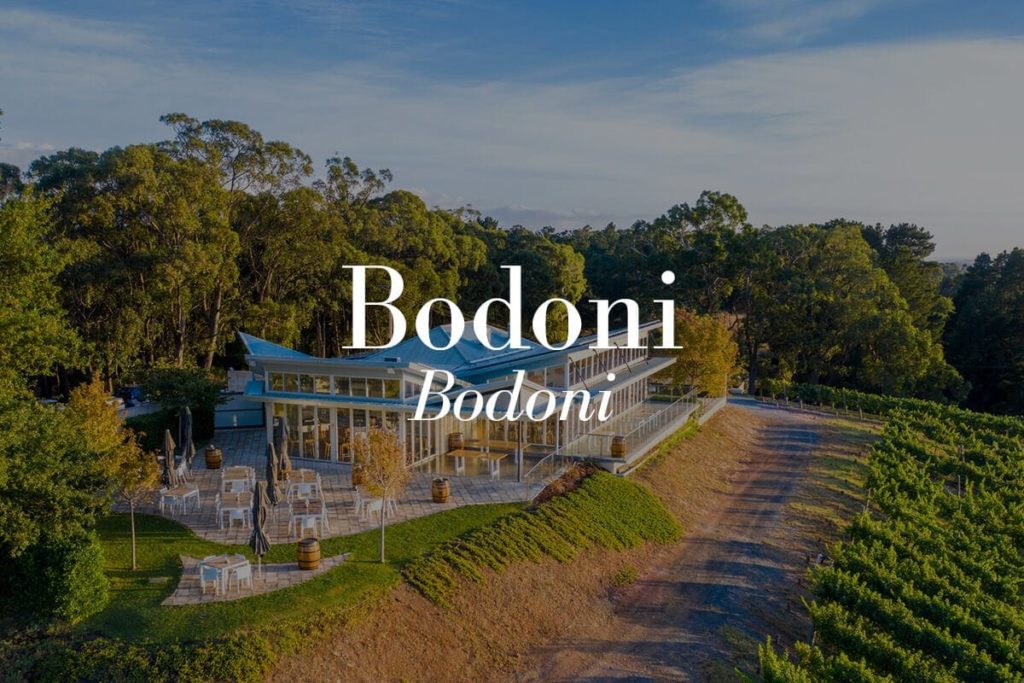
Crafting a magazine design? If so, you probably saw Bodoni. It’s an elegant and timeless style makes it a statement when you’re trying to convey sophisticated content. Not only does it look especially well as a headline for a contemporary design, but it pairs well with itself italicized. Other characteristics of the design, like color, can also aid in separating the fonts from each other and help to bring contrast.
20. Merriweather with Merriweather
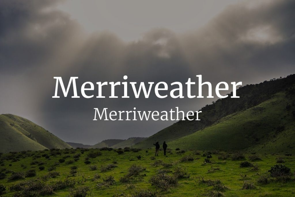
Merriweather was specifically designed as a web font, so stray from using this on any print projects. It’s an emphasis on the feet of each character, making it easily legible and defined. Both as a focal font and as a support font, Merriweather comes in many different weights and styles, making it a classy option to any design.
21. League Gothic Bold with Kollektif
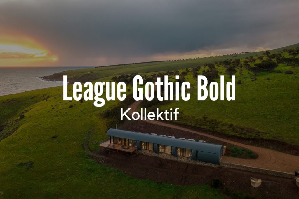
“Unique” is one word that comes to mind when looking at League Gothic Bold. It has a distinctive style to the way its letters are close together, vertically stretched, and a revival of a classic font. With its feeling of strength and easy to read from far away, it pairs nicely with the short and round, Kollektif. The difference in space between the letters and the height, make a perfect balance act.
22. Lato Heavy, with Lato
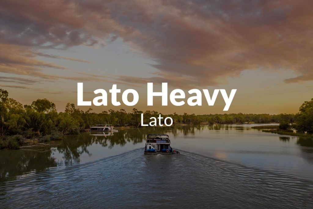
A great website font, Lato adds a warmth to the cold blue light that the digital screens brings us. It has partially rounded characters that bring a friendliness to the bolded font. Lato that’s not bolded is seamless and integrates with most designs. Together with the difference in weights, creates two different fonts that are stable yet delicate.
23. Alfa Slab One, with Coustard
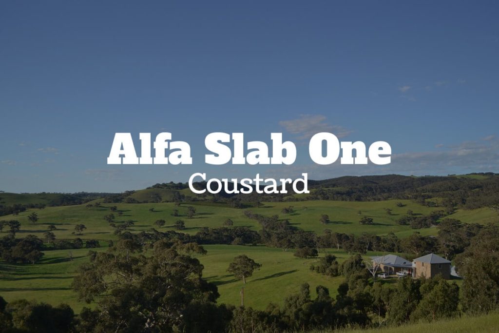
A slab serif font, Alfa Slab One is a style that’s not for the faint of heart. Its loud personality makes it only suitable for certain messages; ensure yours is correctly reflected with this bold font. Paired with Coustard, another quirky font, these two make an eccentric pair. With a thinner font-weight, Coustard works nicely off of the thick boldness of Alfa Slab One.
24. Sifonn, with Bebas Neue
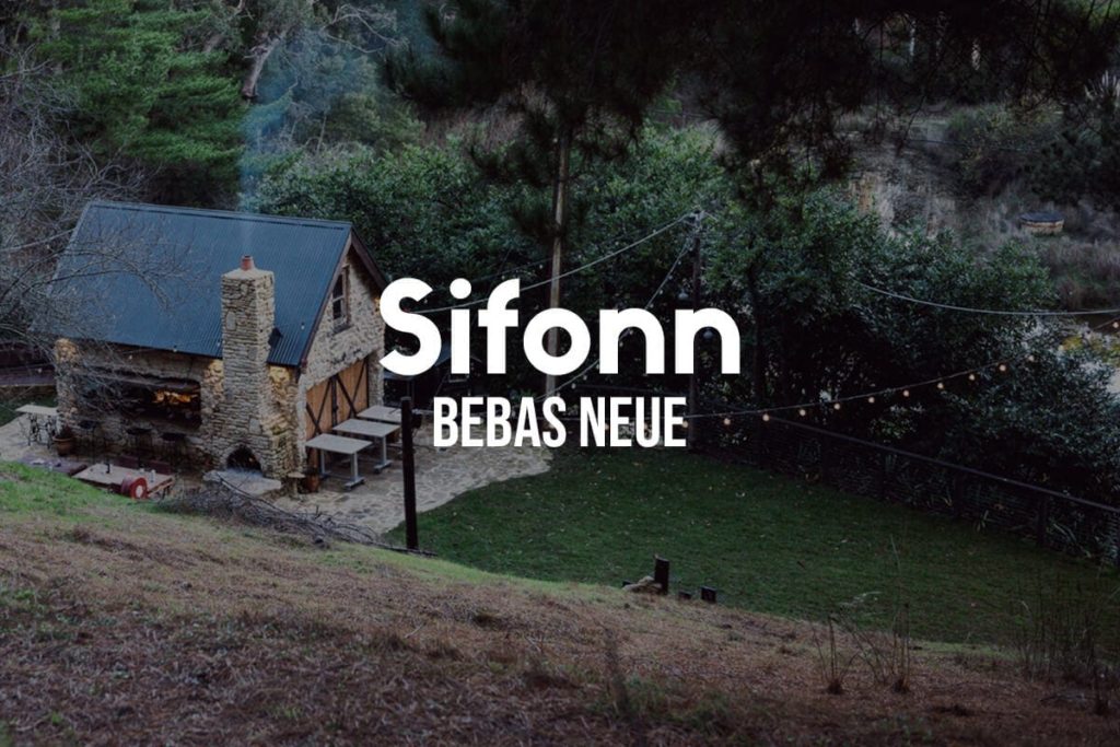
Art deco doesn’t just have its place in architecture or paintings. Strong geometric letters make Sifonn a stand out for any design. Make this font your focal point and your sure to gain the attention of whoever you’re targeting. Working best with less words, Sifonn works off of the straightforwardness and elegant shapes that Bebas Neue portrays. Have a picture you’d like to display text over? These fonts are a great artsy option!
25. Montserrat Hairline, with Montserrat Light
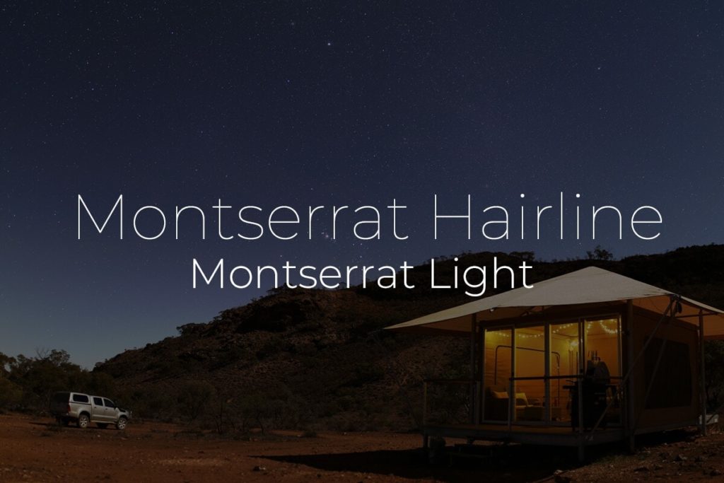
The pin of fonts, Montserrat Hairline is almost as thin as it gets. This fine weight provides a modern style that’s crisp and clean. Looking especially well as a light font against dark backgrounds, this font looks cool as a cucumber. Montserrat Light keeps the boxy design but evens out the weight with a slight thickness. Together, they make great lines for any project.
26. Source Sans Pro with Open Sans
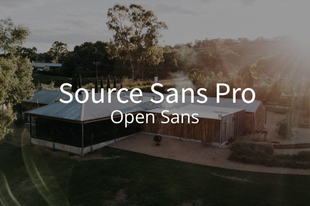
When you’re looking for an easy to read font that works well for corporate documents like reports, Source Sans Pro is a great go to font. Its smaller letters have a higher height, aiding in the readability. Both Source Sans Pro and Open Sans bring a neutral tone to any design, creating an objective outlook for business needs.
27. Six Caps with Archivo Narrow
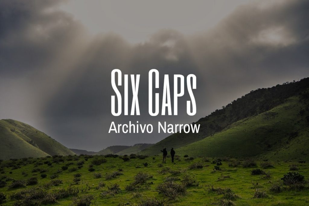
Imagine squeezing and stretching the words on your page and you’ve got Six Caps. The font is so smooshed its best used for titles and headlines, as it would be very hard to read in a space with a lot of words. Also having a condensed font, Archivo Narrow looks airy next to Six Caps. When combined, these fonts create a 60s retro style. This could be an opportunity to incorporate some bold colors into the design as well.
28. Anton with Open Sans Light
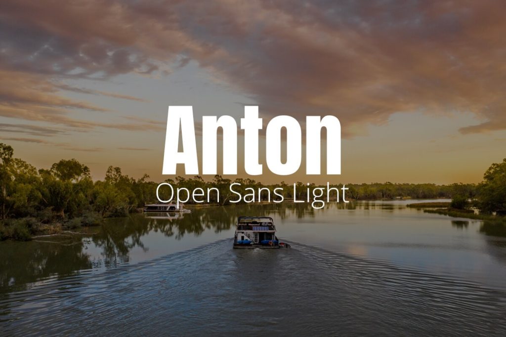
Think big block letters and you’ve got Anton. Or even bubble letters you may have made on posters in grade school, but with an edge. Anton is the definition of traditional advertising, that uses the shock factor of a large letter to gain attention from the reader. To offset this heavyweight, Open Sans Light provides a refreshing lightness and structure with its geometric features.
29. Sacramento with Montserrat Light
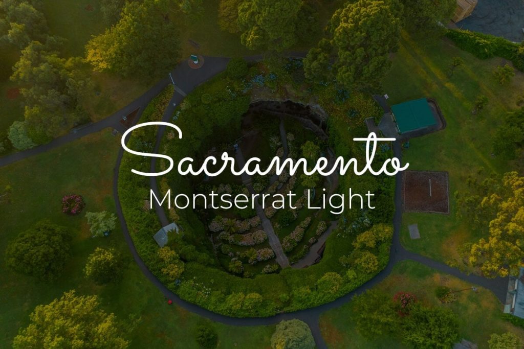
With a touch of authenticity that a script font provides but the perfection of even lines and adequate space, Sacramento is a smooth spotlight font. In fact, this is the font that many wish their handwriting looked like, with its semi-connected lines that provide an effortless typeface. With Montserrat Light, this mixture is delicate and feminine. Montserrat Light allows the script font to take the spotlight, creating a beautiful contrast.
30. Aileron Heavy, with Aileron Light
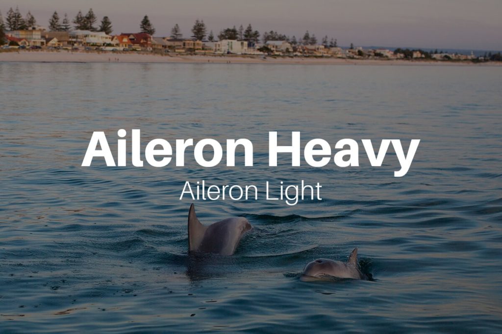
Just like a pair of flare jeans, Aileron Heavy has the structure of straight lines with a bit of flare at the end of each character. These characteristics make it functional and clean, making it perfect for a headline or for a body paragraph. Its simplicity makes it especially great for documents with a lot of copy.
Conclusion
When it comes to font pairing, the most important aspect is testing out the design you believe your message needs. Trial and error is a large portion of the design process and yields the opportunity to see what doesn’t work, with the intention to get a better idea of what may work. There isn’t a set playbook that lists out which fonts should be paired together and which ones shouldn’t (although there are a few that may fall into these categories). Think about your project as a whole including how much space is on the page, the colors you want to use, the message you’re trying to send and the overall theme. Once you’ve got this covered, then think about the font, and its font parter, that will help put all those pieces together.
Also check out: Try our font combination tool
We hope you enjoyed our photos from Adelaide, South Australia.